Aqua Star
A Mississauga mechanical contractor's site built around the two questions an emergency call actually has: can you come, and what will it cost.
Website Development · HVAC & Home Services
What wasn't working
Home services demand arrives at the worst moment, on a phone, from somebody comparing three names in a hurry. The category answers that badly. Most contractor sites open on how long the company has been trading, put four trades on one page so no specific search lands anywhere, and hide both the price and the arrival time behind a form. Aqua Star runs heating, cooling, air quality and plumbing under one licence across sixteen municipalities, which is a genuinely hard thing to put on a website without it collapsing into a list.
What we built
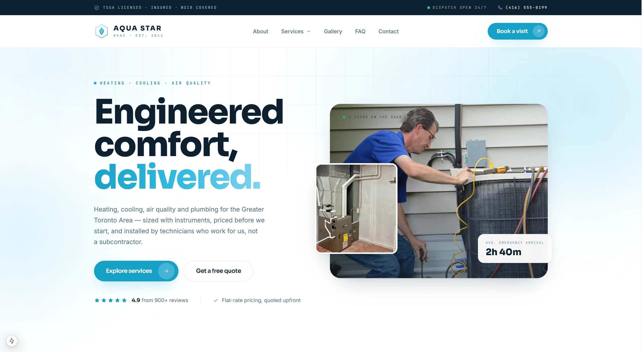
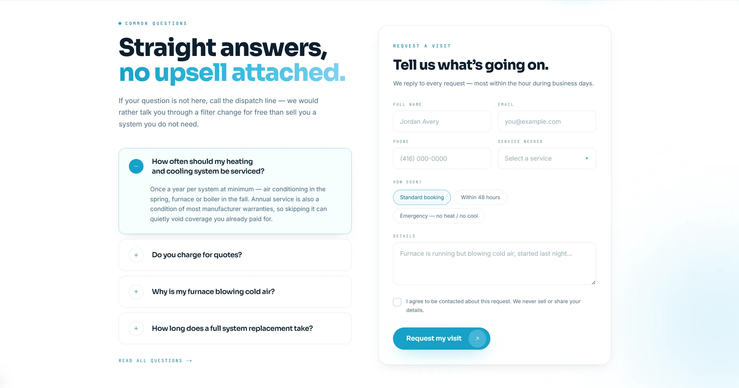
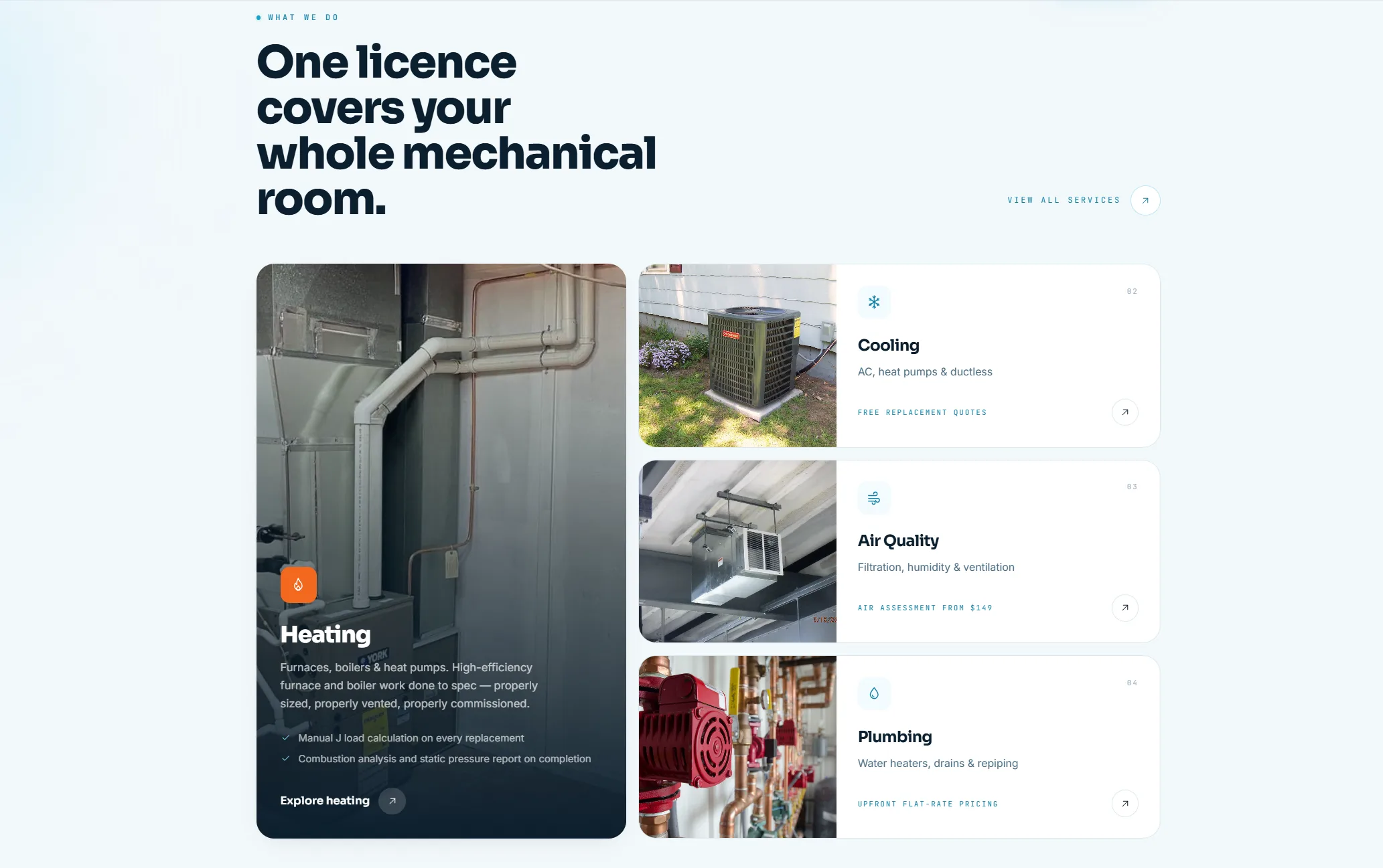
A site that answers availability before it sells anything. The fold carries a live crew count and the current average emergency arrival time, with the 24/7 dispatch number in the top bar on every page, so the urgent question is answered above the fold rather than inside a form. Each of the four trades gets its own page and its own entry point, with the technical commitments stated as sentences: a Manual J load calculation on every replacement, a combustion analysis and static pressure report on completion. Credentials sit in the footer as checkable facts rather than badges, reviews carry the job type and the platform each one came from, and the request-a-visit form opens with urgency rather than ending with it.
How people find it
Emergency trade search is the most local search there is, and it now resolves across three surfaces: the map pack, an ordinary results page, and an assistant asked who to call for no heat at eleven at night. Four trades across sixteen municipalities is a large number of versions of that question, and a combined services page answers none of them.
One page per trade
Heating, cooling, air quality and plumbing each state their own work, pricing basis and commitments on their own page, instead of four trades sharing one and competing for the same result. A specific search gets a specific page.
Availability and response time as text
Dispatch hours, the average emergency arrival time and the service area are written as readable content rather than drawn into a graphic. That is the material an assistant can quote when somebody asks who covers their city tonight.
Credentials stated as facts
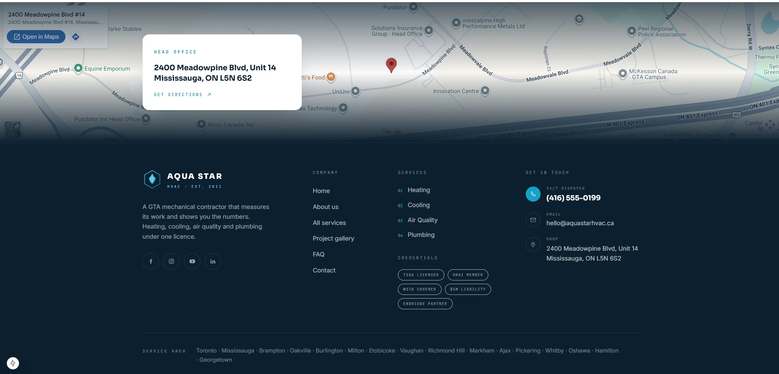
TSSA licence, HRAI membership, WSIB coverage, liability cover and the utility partnership are named individually in the markup rather than shown as a row of logos. A logo is an image; a named credential is something that can be checked and cited.
Reviews carried with their source
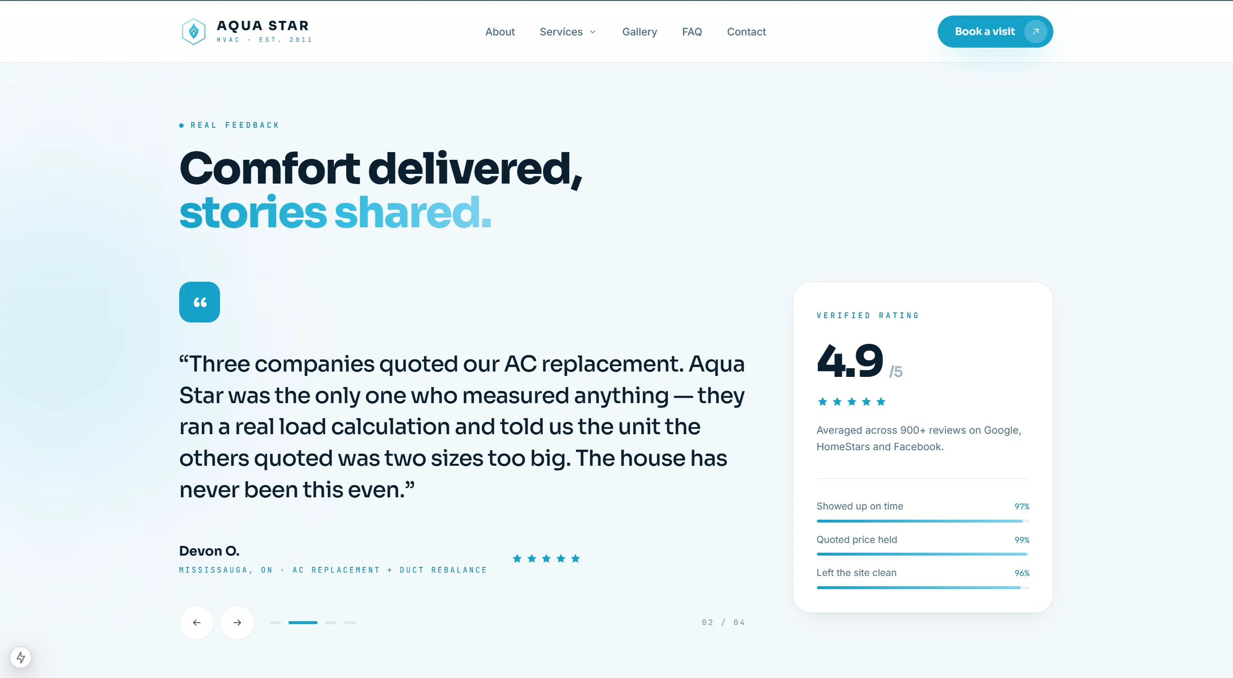
The rating is attributed across the platforms it was averaged from, and each testimonial carries the job it relates to and the city it came from. Reviews tied to a specific job in a specific place read as evidence rather than decoration, and they are the strongest signal in a category people buy nervously in.
The whole service area named
Sixteen municipalities listed as text in the footer, and matched to the coverage claimed elsewhere on the site. A service-area business that names its area consistently is answering the question the map pack and the assistant are both asking.
Client
Aqua Star HVAC
Stack
- Next.js
- React
- TypeScript
- Tailwind CSS
Results
- Positioning
- Measured work, with the numbers shown
- Urgency
- Live crew count and average arrival time above the fold
- Structure
- A page per trade, sixteen municipalities served
Page by page, as it shipped.
Drag, swipe, or use the arrows. Nothing here is a mockup.
01of 05